Why is a “before” and “after” so magical? I think it’s because it’s a vision come to life. Using our imagination to envision and create a space where we enjoy dwelling is delightful.
When I bought my first home in July of last year in the middle of the pandemic, I was beyond elated. The idea of owning something that I could renovate to my heart’s desire was a feeling I had never known. There were things about the house that I didn’t love, but I was trying my best to be grateful and patient, waiting for the right time to execute changes.
Our two bathrooms were top of the list for the “major” renovations, so of course we started on them first. The only thing is, we had just had a baby (my son Aaro) on June 3, and we didn’t realize that blasting out walls and working on one bathroom while we used the other was going to be crazy. Thankfully, we had the kindest contractors who I actually enjoyed working with, despite the pounds of dust covering our home at all times and the many baby wipes I used on my feet before going to bed!
I hope this process below is helpful if you’re thinking about renovating and want to give a huge shoutout to two of my favorite brands who were a dream to work with, Fireclay Tile and Signature Hardware.
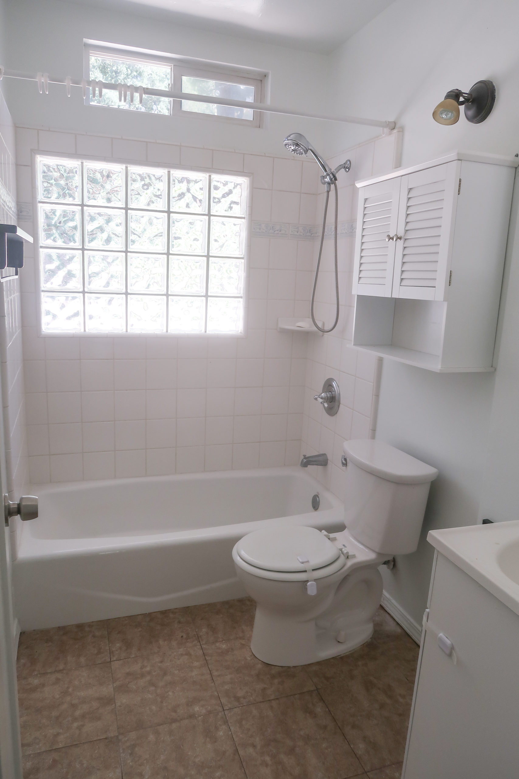
Bathroom No. 1: Before
This bathroom was small and had an awkwardly placed tiny sink facing the wall by the door. The first thing we did was push out the left wall to make two more feet of space. Then, we removed the toilet, cabinet and sink and installed a hanging toilet on the left wall to save space.
 Bathroom No. 1: After
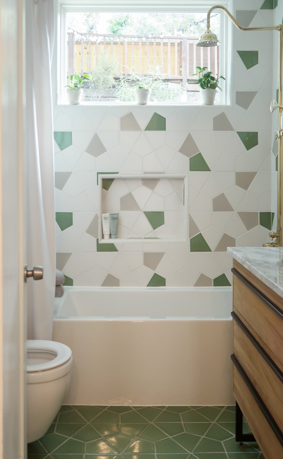 The difference is shocking! I didn’t realize how adding a real window instead of glass bricks would let in so much light. I thought two feet of space wouldn’t make the biggest difference, but it opened it up and created a dreamy and functional room! I’ll walk you through the details and choices.
First, I had to choose a color scheme for the tile, since that is what always has to be installed first. My husband and I love nature, and green is my favorite color. So I chose these tan and green tones from Fireclay Tile. Based in San Francisco, they have the most innovative hand-fired designs I’ve ever seen.
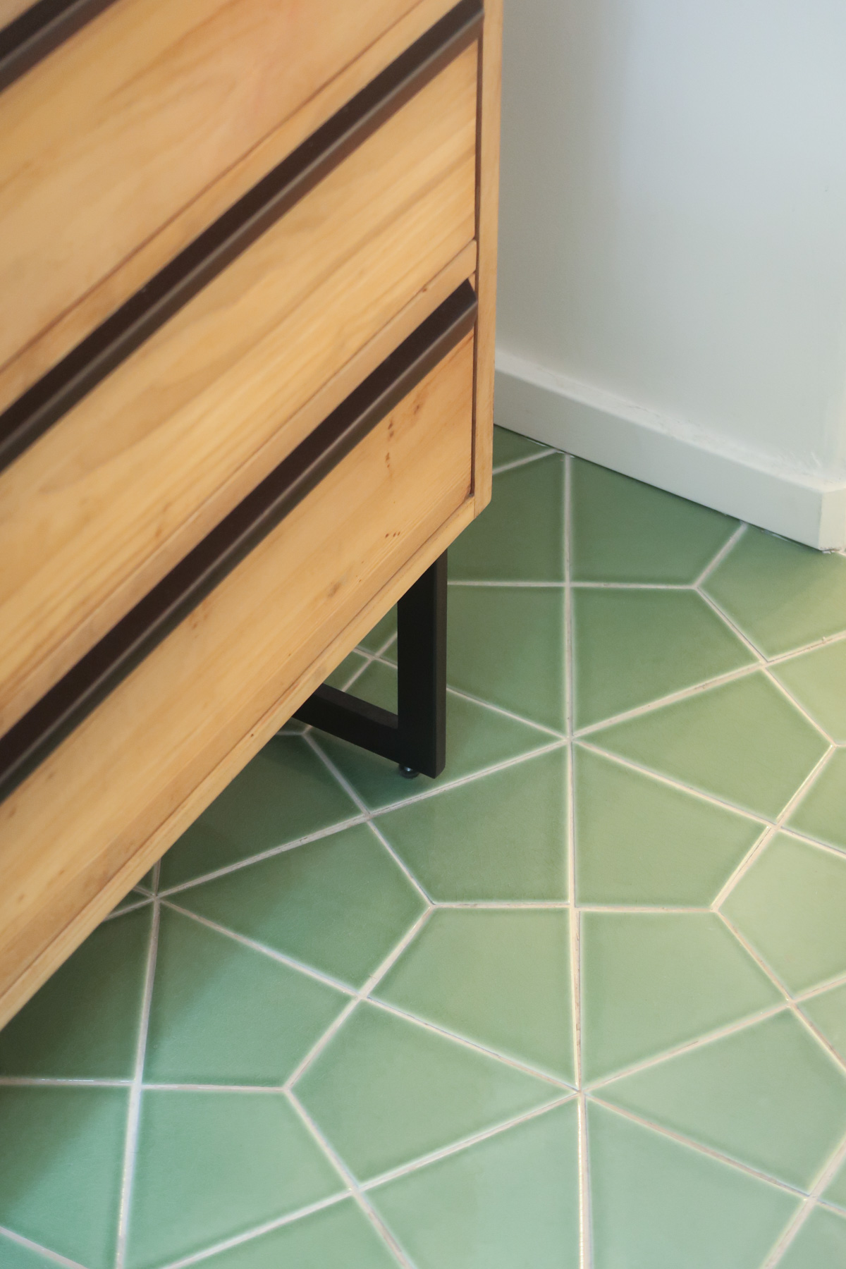
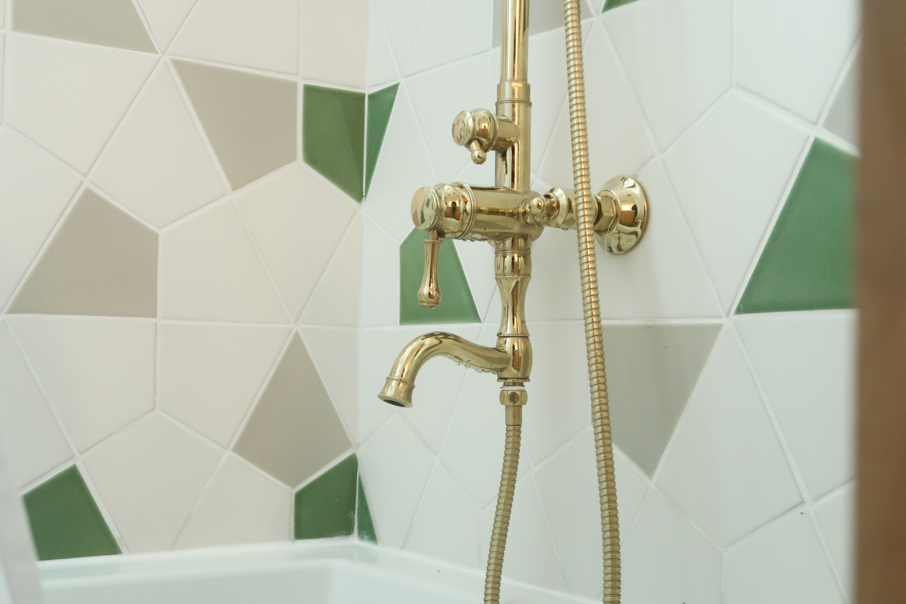
This Hexite tile is a unique shape and I wanted the walls to look like a fun confetti party using their colors of Halite, Kelp and Eucalyptus. We literally photoshopped the tile placements on this wall for the tile installers to reference so we’d get a balanced, yet not too perfect pattern. The solid Kelp green on the floor feels like walking on a sea of green shiny glass.
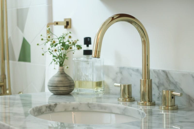
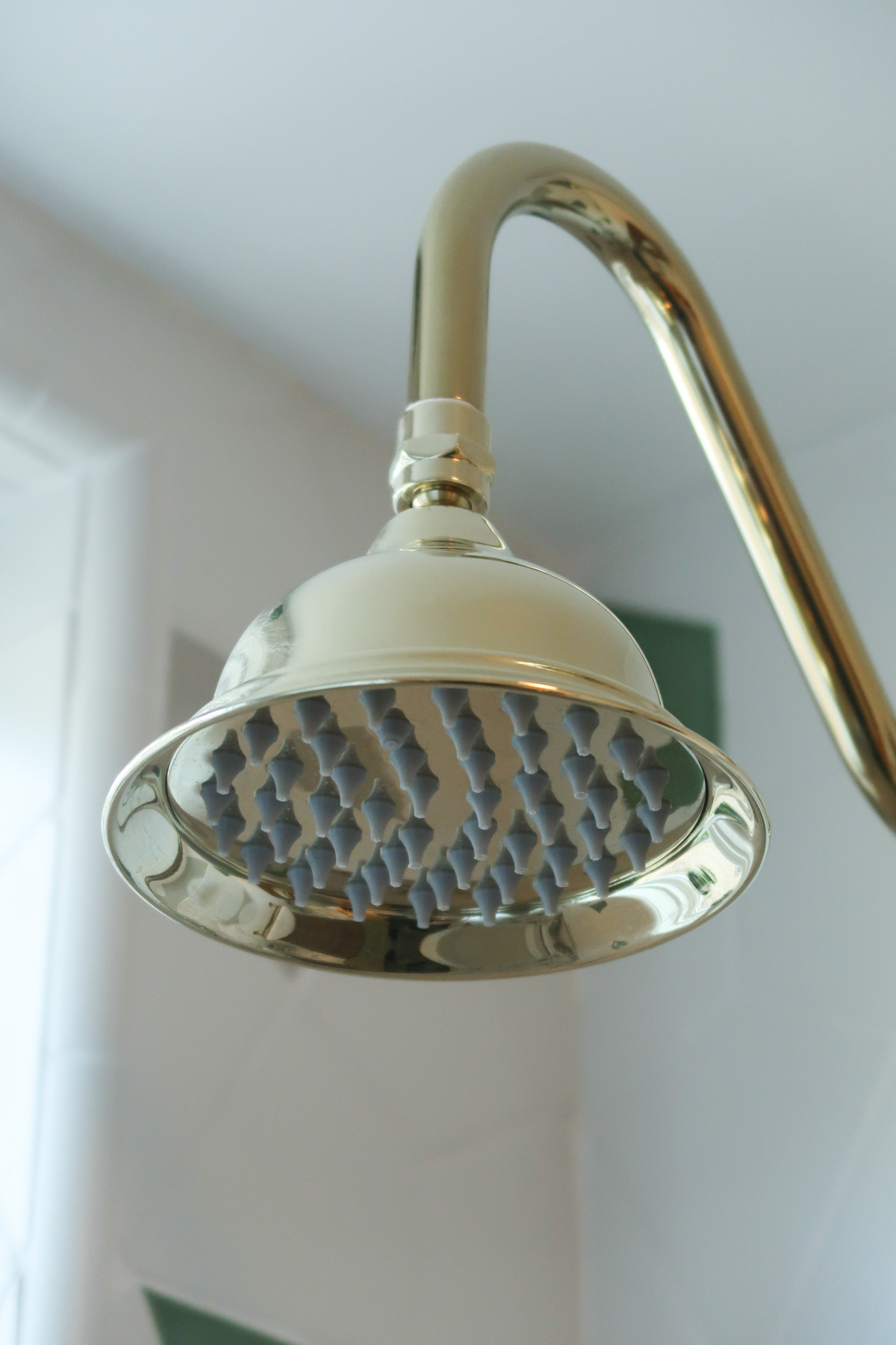
 Next, I chose the other main hardware and pieces from Signature Hardware. They have such a large amount of choices and perfect items for small spaces as well. This Cael Teak Vanity with Carrera marble top is so beautiful! The drawers are deep, and they slide and close so smoothly. I chose the Rotunda Widespread Bathroom Faucet in this gorgeous polished brass color to match the fun Dolwick Exposed Pipe Shower and Tub Faucet and compliment the deep Sitka Acrylic Alcove Soaking Tub.
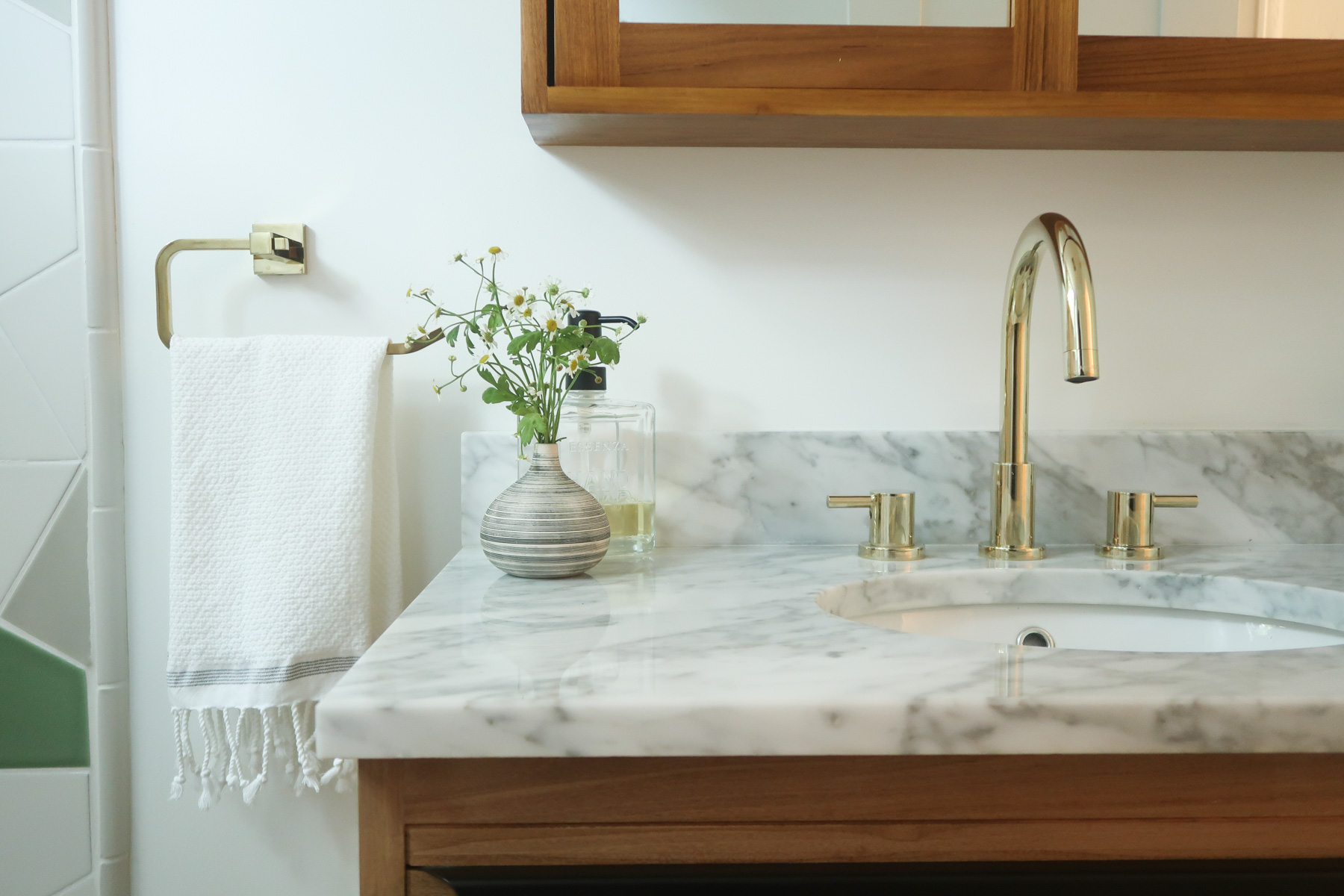 For the small details, I loved this uniquely shaped towel holder. Also, how cute is this Mediterranean Organic Towel by Coyuchi that I found on Made Trade? They have the coolest towels and bathmats, and I’m now a huge fan of their eco-friendly, sustainable and vegan goods!
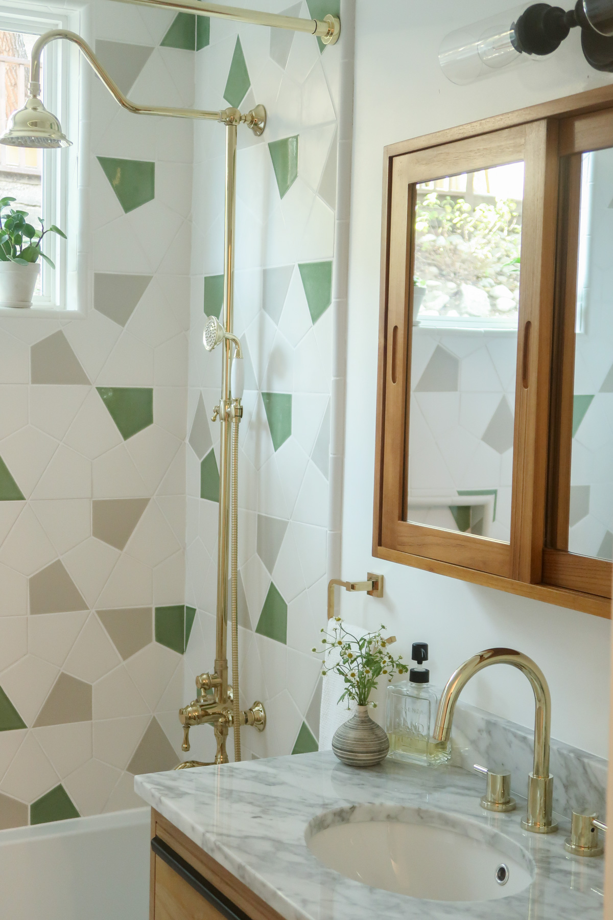 I love the way the exposed pipe looks and the shower wand is perfect for kids. I was going to do a glass door, but then decided that this Straight Solid Brass Shower Curtain Rod from Signature Hardware with their white Cotton Shower Curtain would be a better look as I love the way fabric adds warmth to a bathroom.
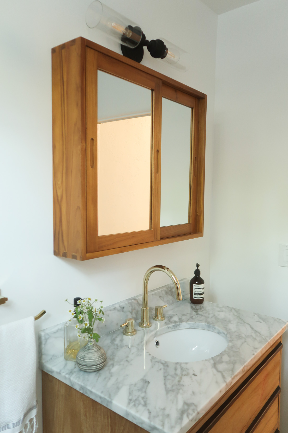
 To store all my favorite beauty products and keep the bathroom looking minimal, I chose the Wulan Teak Medicine Cabinet and this black vanity light that’s stylish and modern. These cabinet doors slide so easily and quietly, and I love keeping everything hidden away to help the space feel tidy.
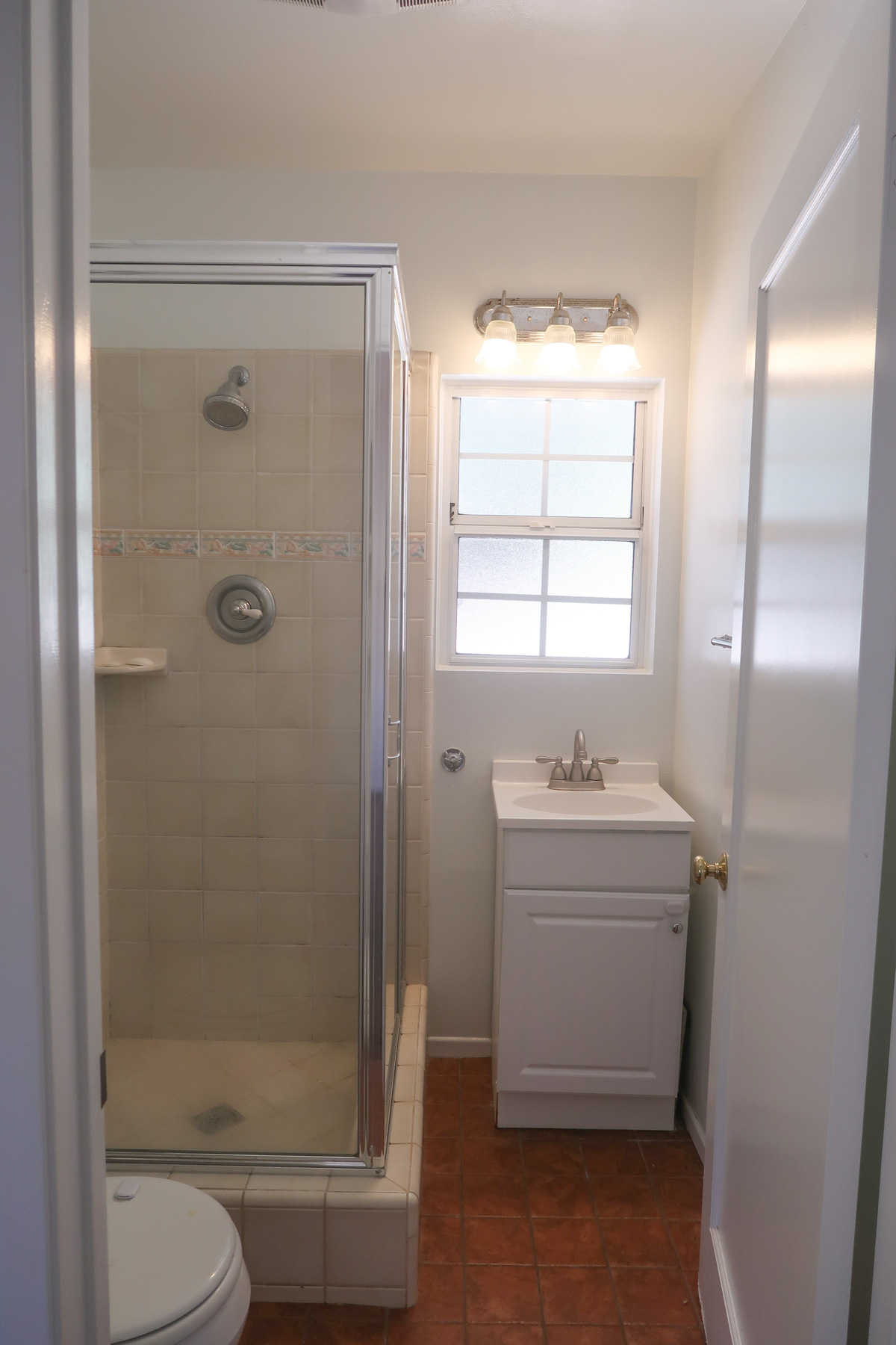
 Bathroom No. 2: Before
This space was so tight you could hardly get in the shower or sit on the toilet without the door hitting you. The tiny sink was also something I wanted to replace.
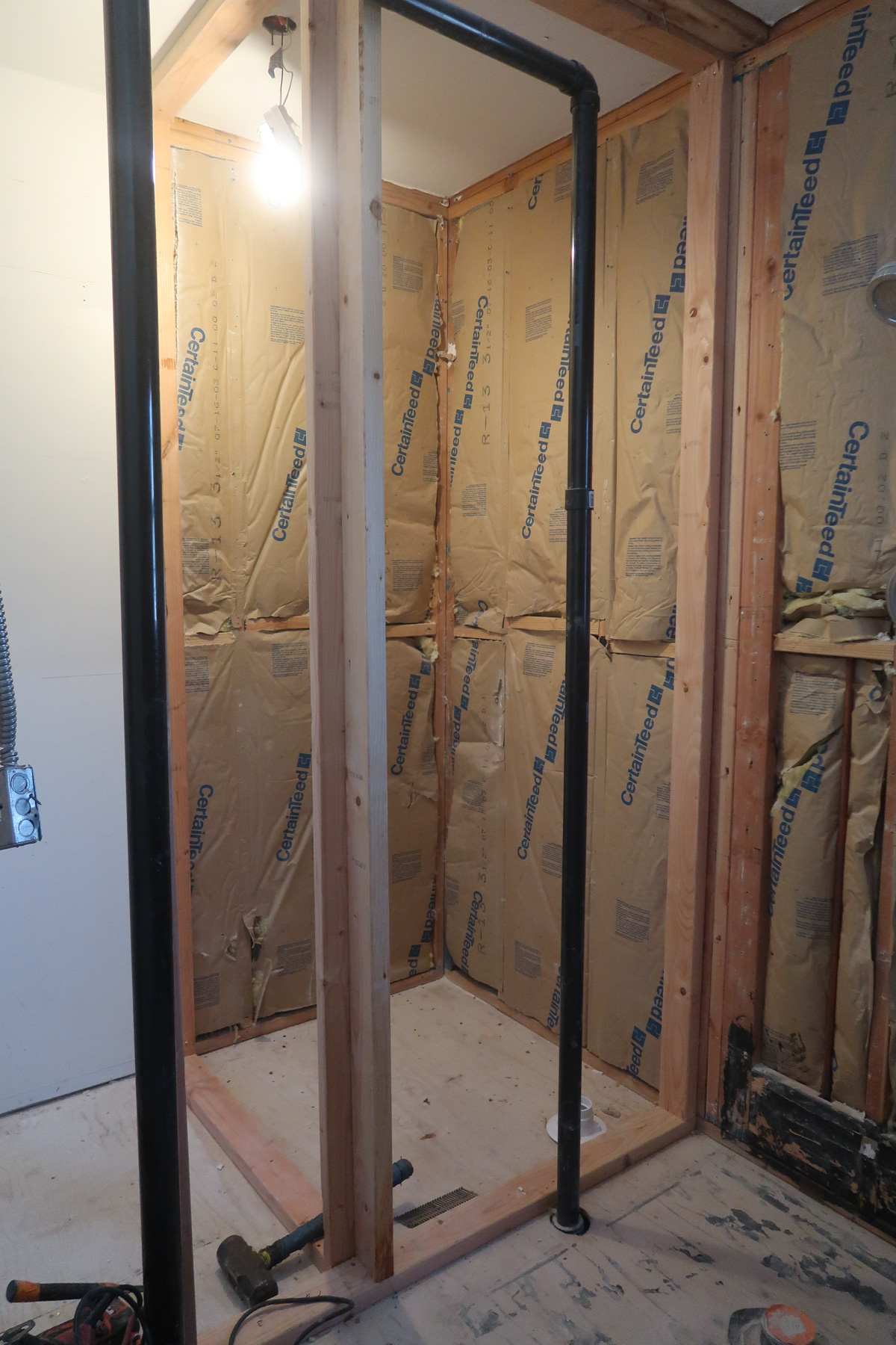
 Since we pushed the other bathroom two feet into this one, we had to also expand this space. Thankfully, there was a closet next to the left inner wall of the shower, so we pushed the wall out so the shower space could go instead where the back half of the closet was. But it still left half of the closet in the other room, so it was a perfect solution!
 Bathroom No. 2: After
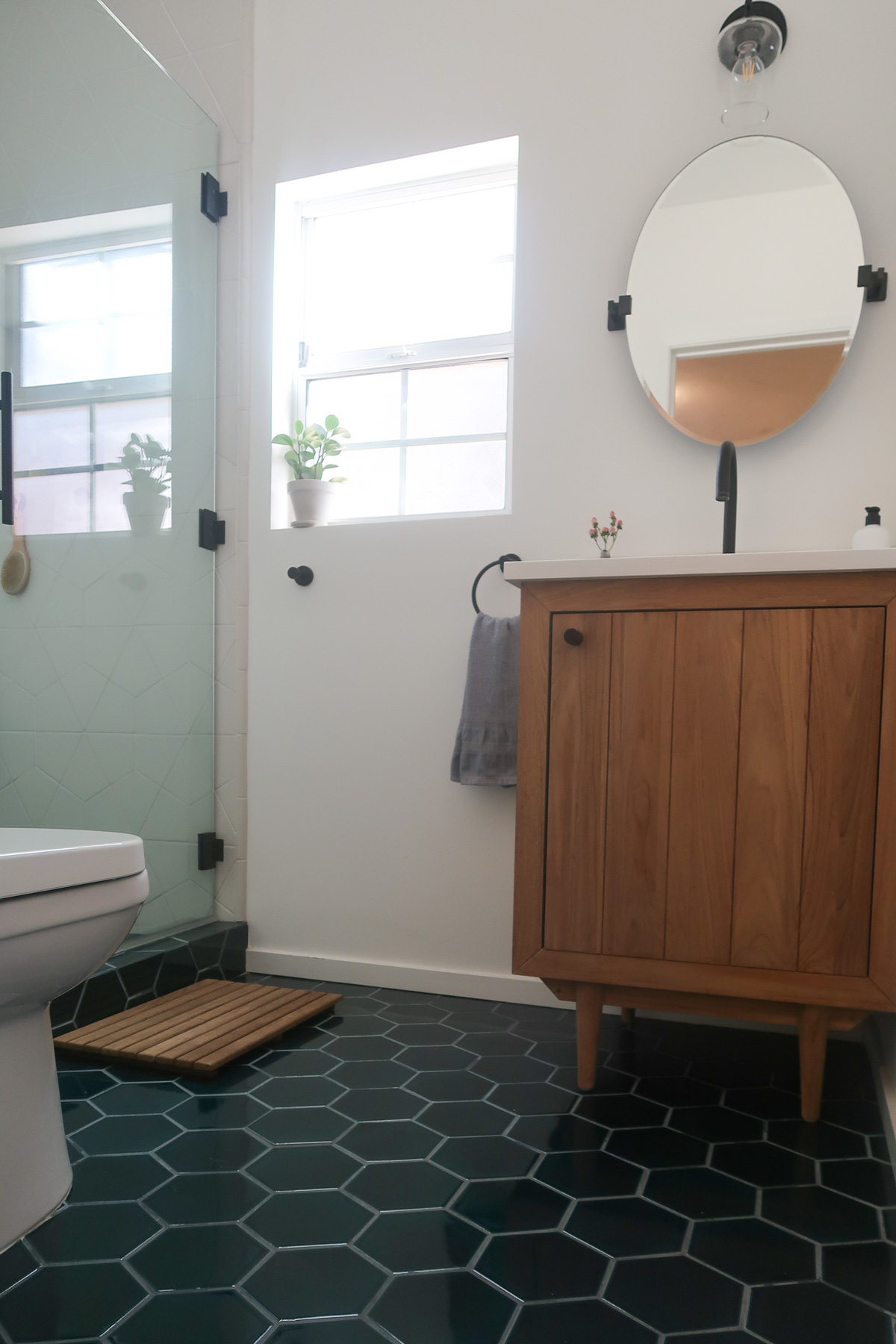 This one truly had the most transformative feeling! I couldn’t believe how opening up just a few feet of space would make it feel worlds apart! Again, the first choice was tile. The name Caspian Sea was what got me. This Fireclay 6″ Hexagon tile is literally so stunning in person. It’s shiny and looks like deep blue water.
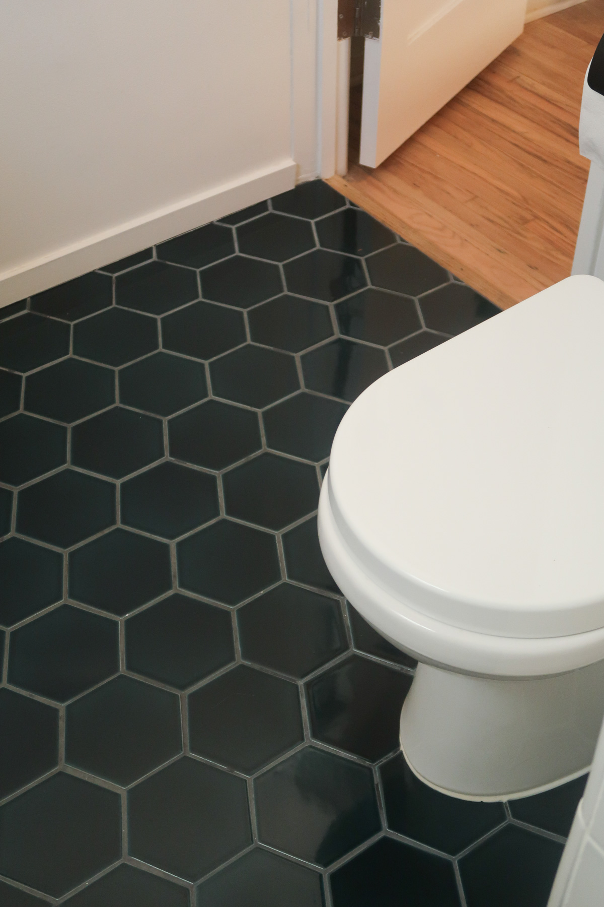 For the shower floor, I also wanted the Caspian Sea tile so it would look like it’s “spilling” out onto the main floor. I chose the Fireclay Hexite pattern (same tone as bathroom No. 1) for the walls so it would be a simple yet stark contrast of color.
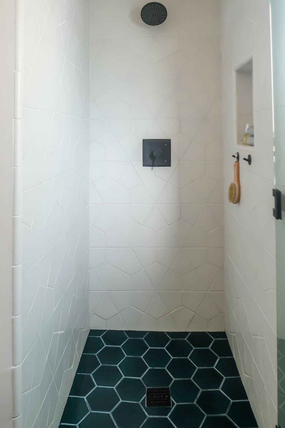
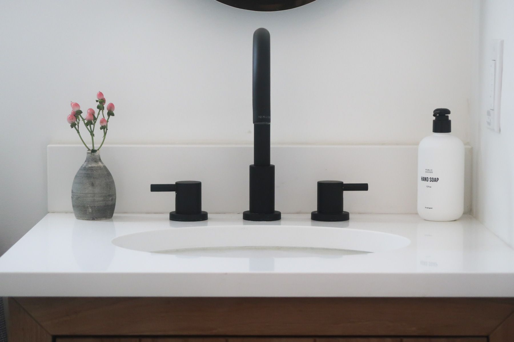
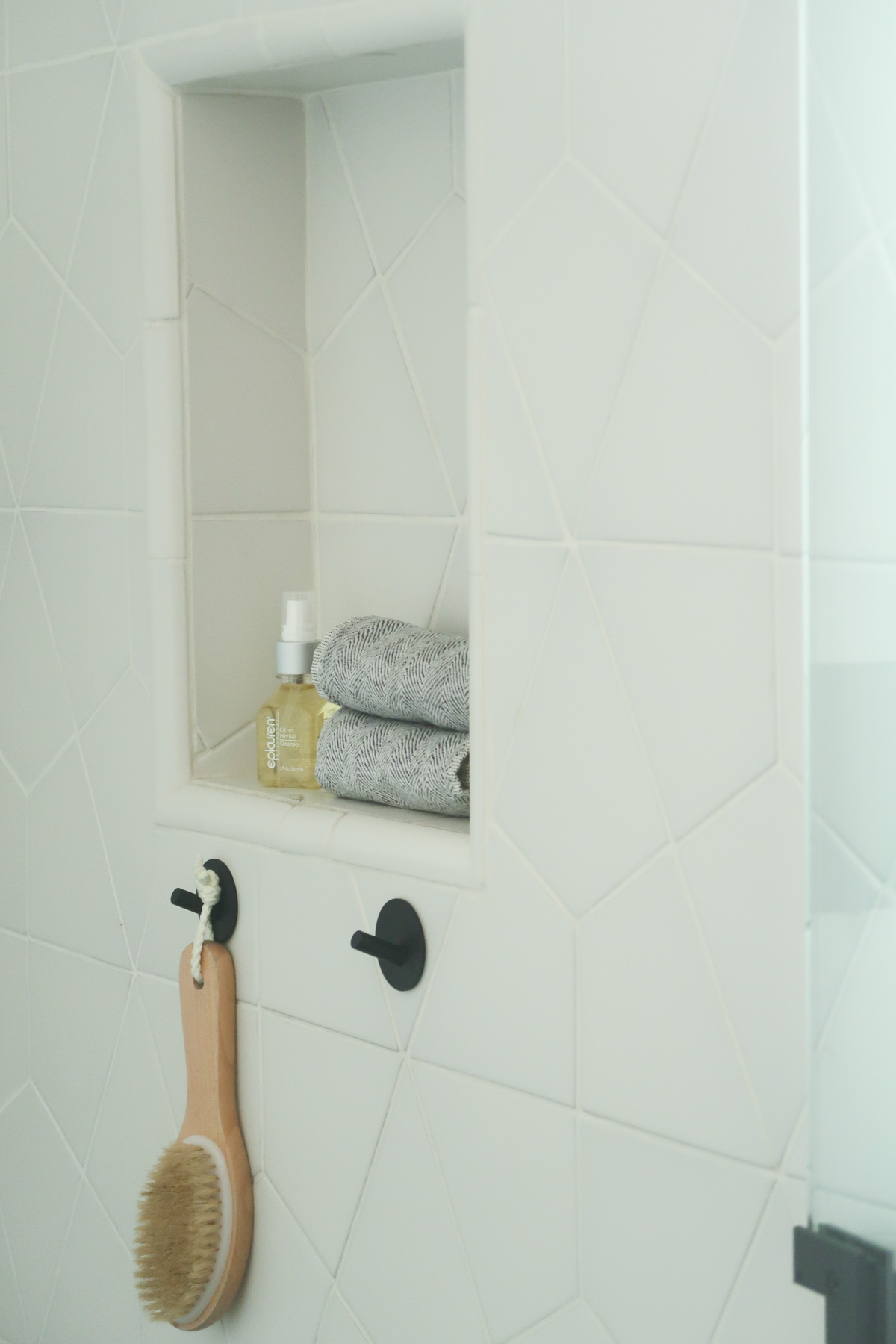 For the hardware choices, matte black was my theme. I love this shower faucet set from Signature Hardware that also matches the Rotunda Widespread Bathroom Faucet, Rotunda Euro Toilet Paper Holder and Rotunda Towel Ring.
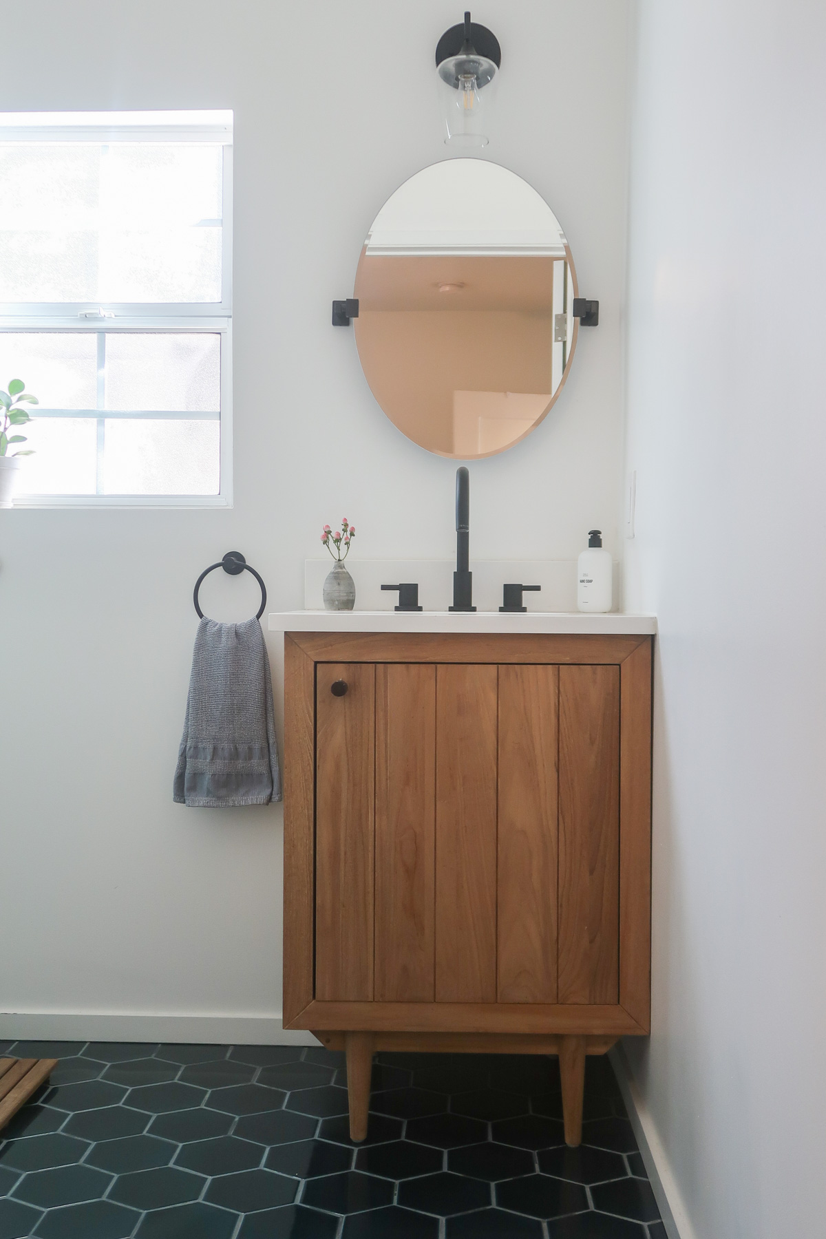 Since this is such a small space, the vanity, mirror and light had to have very slim dimensions. I found this Signature Hardware Helsinki Oval Tilting Mirror and Ashford Vanity Sconce light that fit just perfectly. The mirror also tilts, which is amazing for putting on makeup. This Osa Teak Vanity goes well with the other bathroom, but it has a slightly different design. Their vanities are so well-designed and the Arctic White Quartz top is gorgeous.
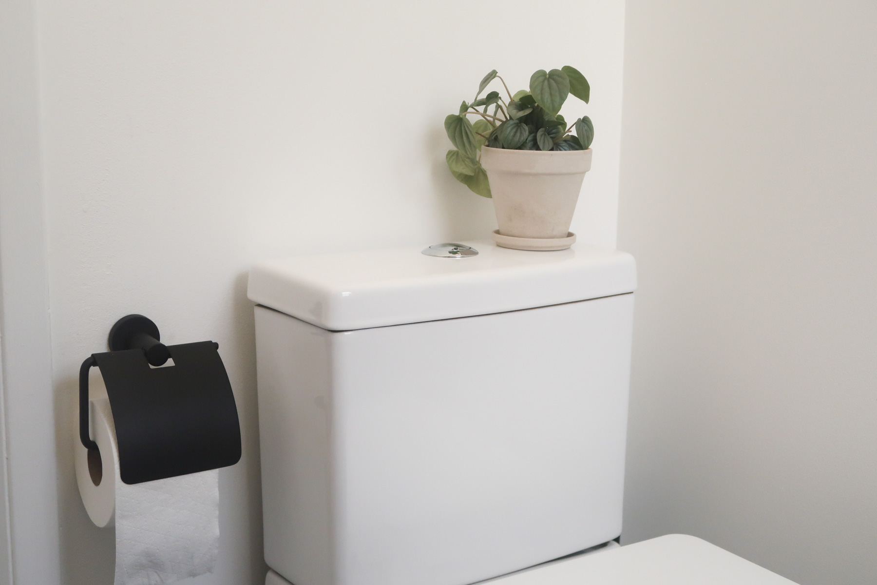
 This sleek looking toilet was the perfect fit for the new layout. Also, throughout the space the Bloomscape plants add some warmth and a beautiful color contrast to the blue, black and white.
 So there you have it! While this process took a few months, I am so grateful that I learned the process of renovation and what it means to go with my gut creatively in choosing items to truly make a space my own. It’s not always about what you “think” you should choose, it’s about choosing what you like and being confident in your creative decisions.
For more home decor finds and inspiration, be sure to follow Fireclay Tile and Signature Hardware on Instagram!
Images via Darling

