Instagram is many things to many people (um, pet Boomerangs, anyone?) but at the end of the day, nothing beats it as a vehicle for honing a powerful aesthetic statement. That grid of tiny squares can serve as a beautiful record of your evolving creative expression, and with a little additional know-how in the arts of crafting and capturing your images, this can be your year to watch that creativity take flight!
So, in the interest of taking your Insta game to the next level in 2017, here are four mistakes to avoid — and ideas on how to fix them!
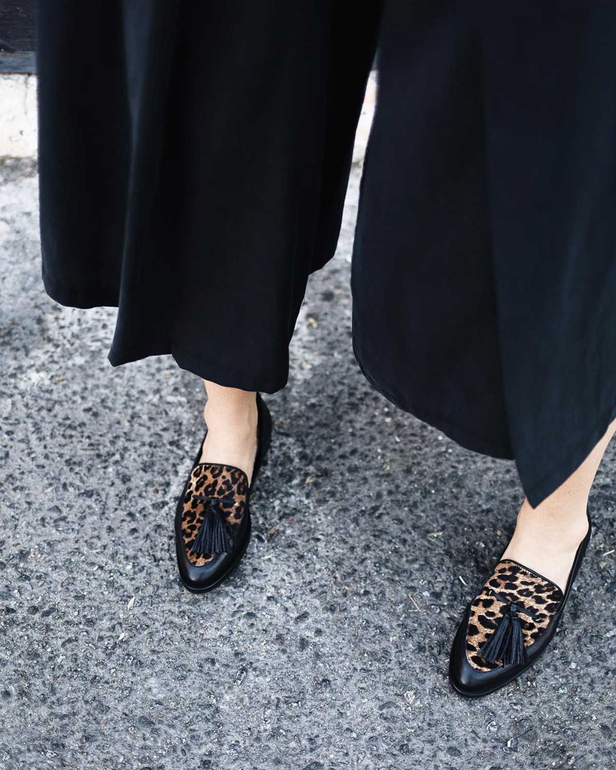
1. Expecting to Be Perfect
Styling and photography, like any lifelong pursuit, is all about practice practice practice! The more you do it, the more you’ll hone your capabilities. So flex those creative muscles by giving yourself permission to get messy, make mistakes, and learn from those whose work you admire. Immerse yourself in learning experiences — like the styling and photography course I’m teaching with master stylist Annette Joseph in LA on January 28-29! — and you’ll watch your skills burgeon faster than you can say #latergram!
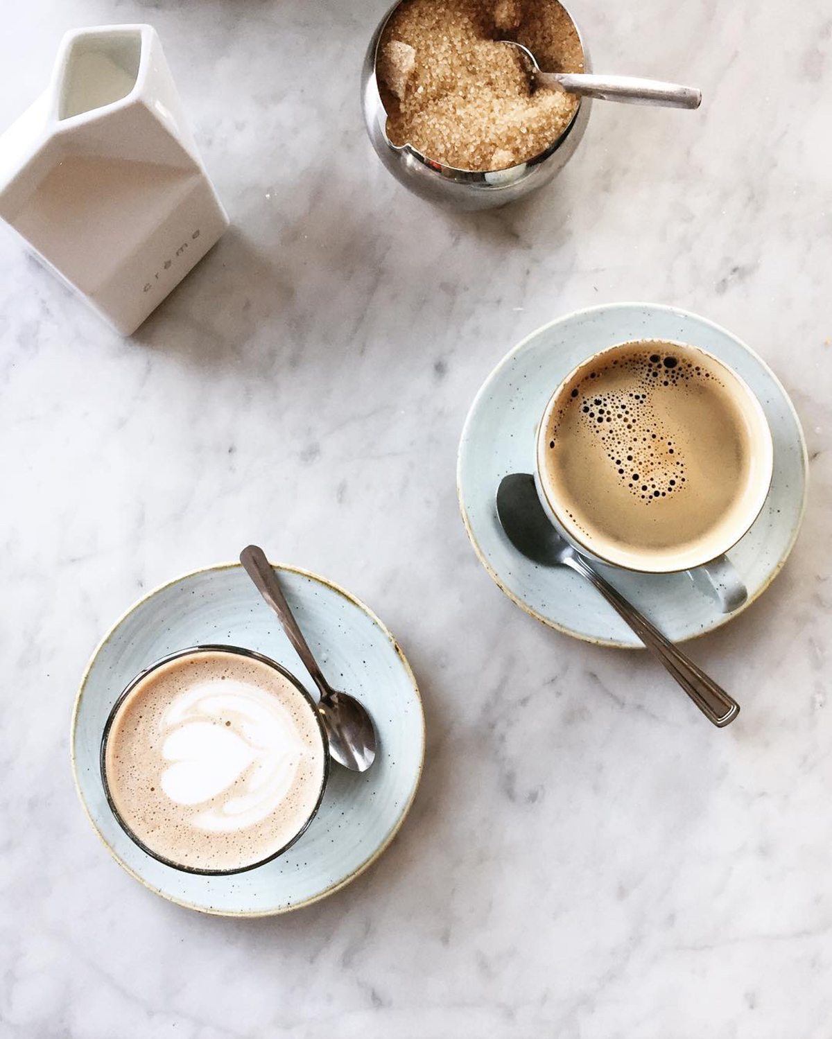
2. Posting a Zillion Versions of the Same Shot
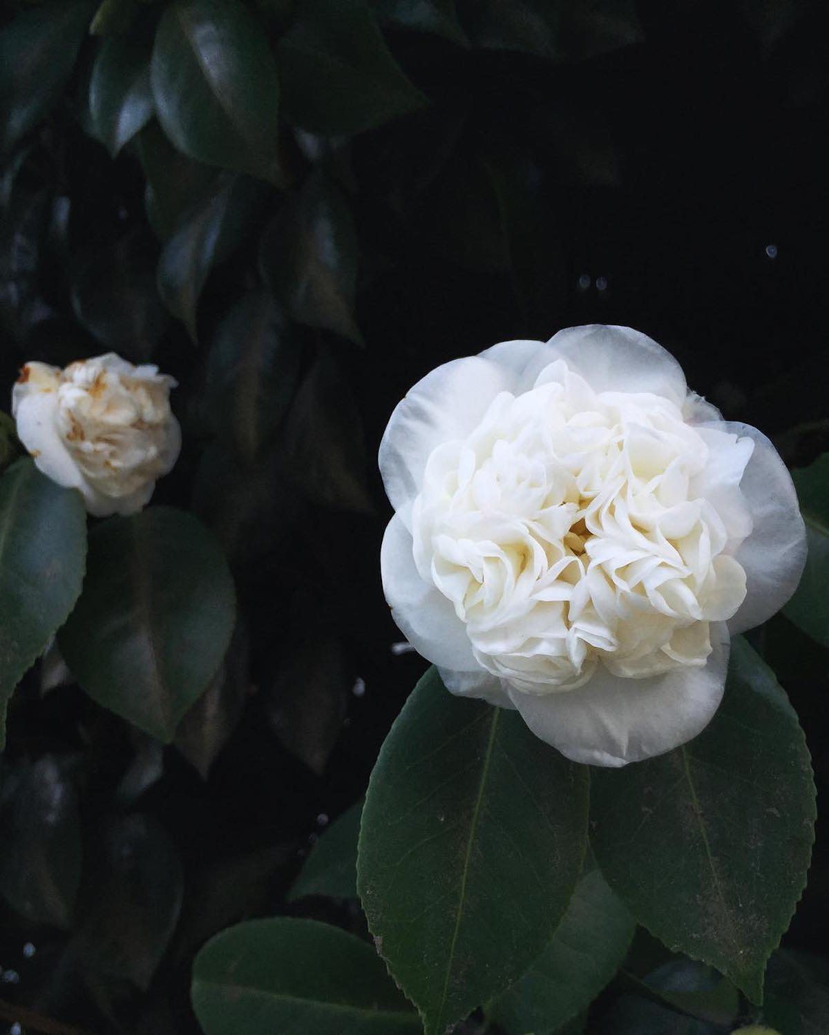
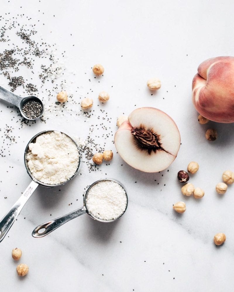
Unless your Instagram feed has a specific theme — for example, all flat lays — vary the types of shots you share for a gallery that’s vibrant and engaging. Explore different types of framing, angles, and distance from the camera and your followers will love you for keeping them on the edge of their seats for what’s next!
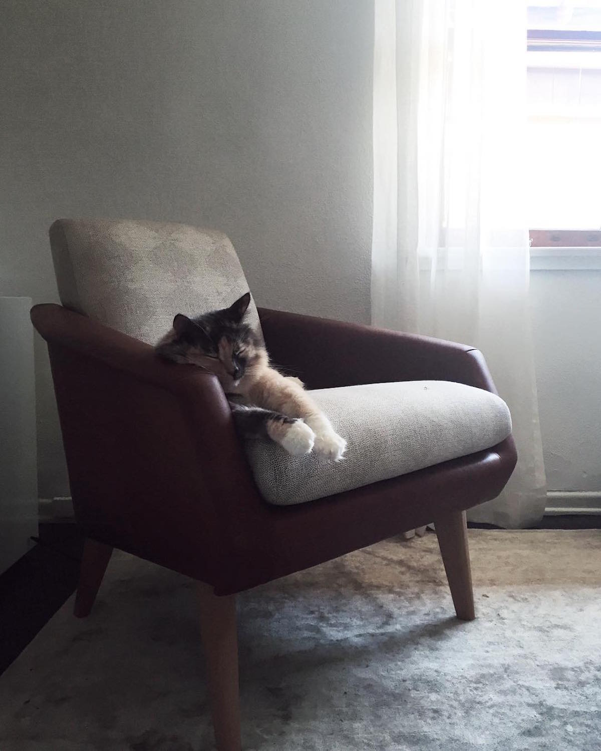
3. Positioning Objects in a Straight Line
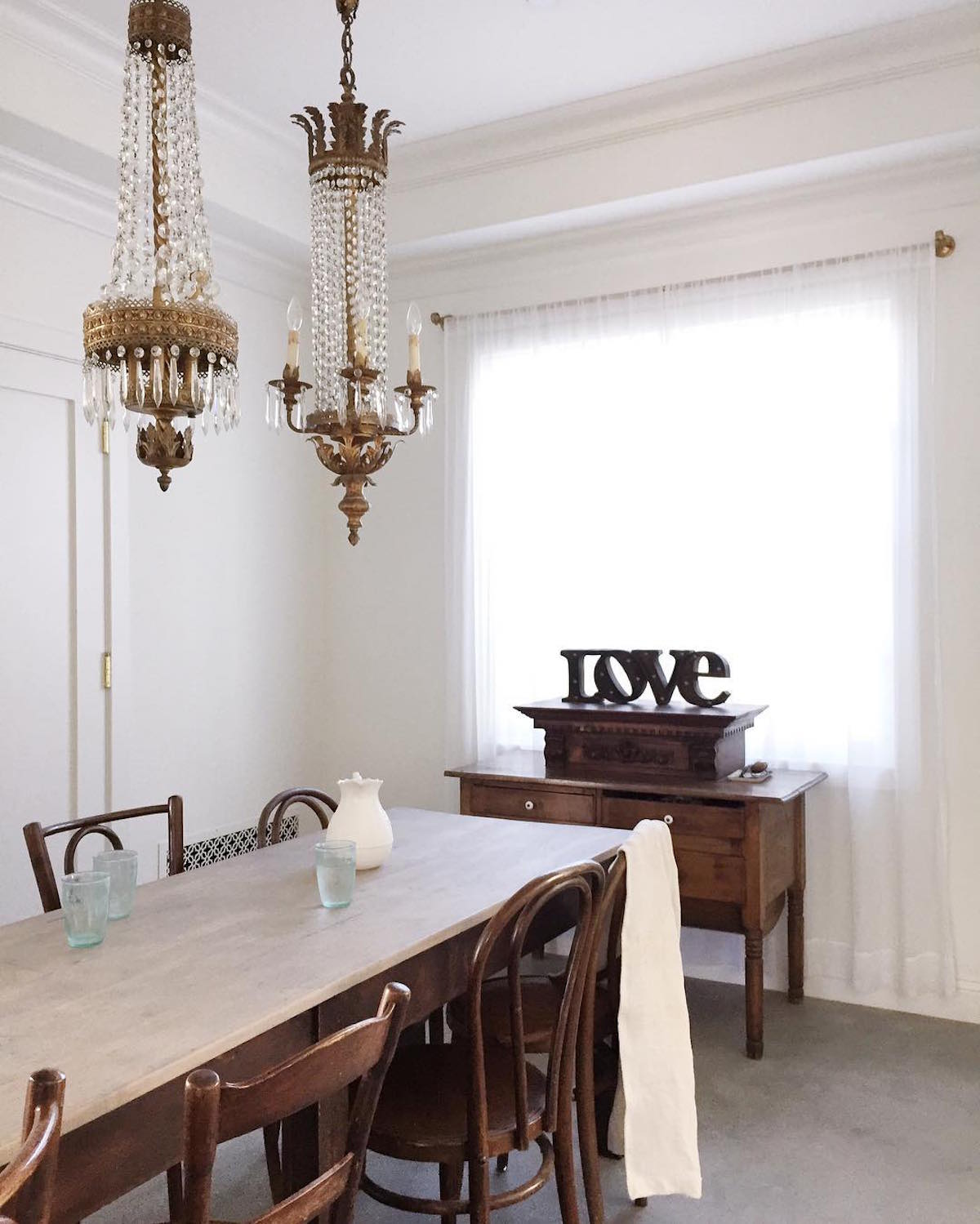
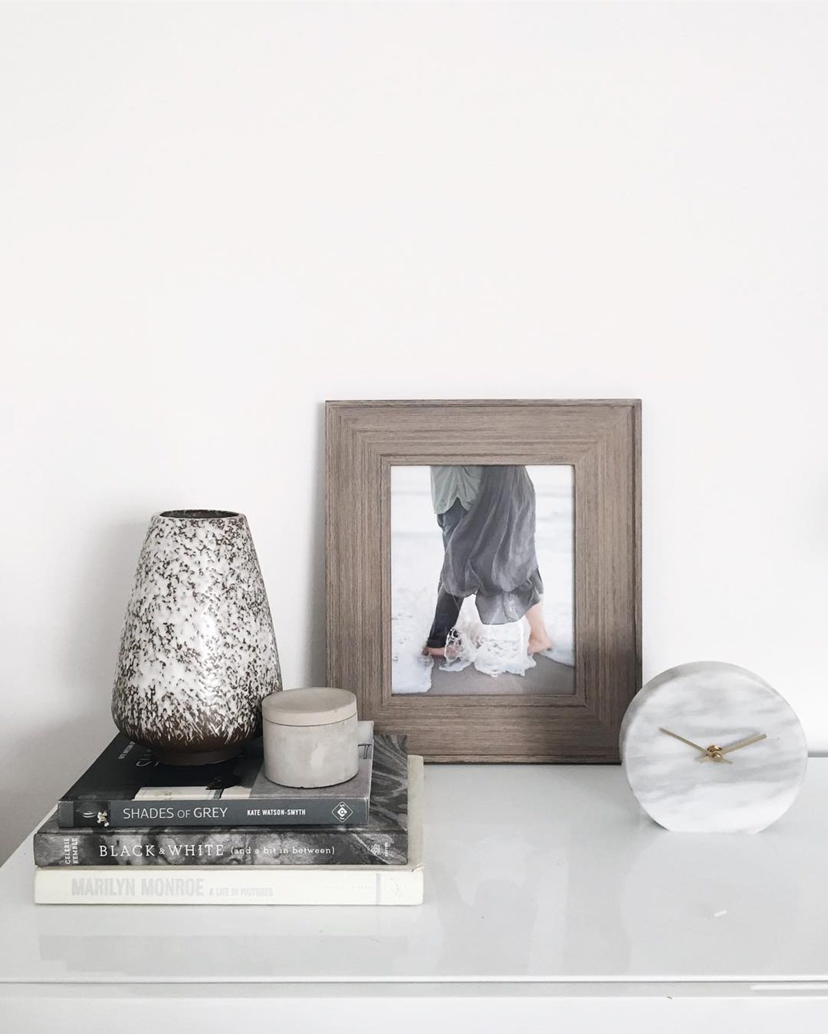
Memorable images move the eye through the frame for a dynamic feel. To avoid shots that feel static, tweak the positioning of objects in your photo to create an ’S’ shape. The result will be a photo that — although it’s been styled — actually feels more natural and effortless than if you hadn’t touched it at all!
4. Using the Same Go-To Filter for Everything
In the desire to for cohesive aesthetic, it’s tempting to use the same filter for each photo you post. However, not every shot is taken under identical lighting conditions, meaning that even your favorite filter isn’t guaranteed to create a uniform look. Instead, have a few favorite filters at your fingertips, and don’t forget also to adjust temperature, tone, shadows, and highlights!
For more guidance on achieving Instagram greatness — and tons of practice using beautiful props! — join me at Light Lab in Los Angeles for a two-day styling and photography workshop. In this two-day intensive, January 28-29, the foundations of great design will combine with savvy social media strategy to get your creative juices flowing more freely than ever before!
How do you find creative inspiration on Instagram?
Images via Anne Sage





2 comments
Great suggestions! I am so guilty of number one! I’ve only been on the instagram world for about a year, and have only been taking pictures with something other than a phone for a few weeks. After I attended a creative conference last year, I stopped using filters. I just brighten my photos or adjust the warmth or contrast and they look much more natural too me! I Need to work on positioning my objects tho. I love what you said a record of evolving creative expression.
Great Article!
Hannah/ IG @theblessedlittlelife
http://www.recovering-hope.blogspot.com
Hmm, I always use the same filter and find that it helps unify my feed. But I compensate for the varying lightings in the different pics by adjusting other things like brightness!
Charmaine Ng | Architecture & Lifestyle Blog
https://charmainenyw.com