Winter, summer, spring … When is wine not a compliment to whatever it is (in whatever season of life) that we’re celebrating?
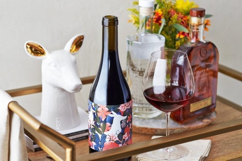
For those of us who love to pop a bottle, but who also may be a little intimidated as to which bottles of wines are actually worth popping, never fear. We’ve recently discovered Barrel + Ink, a San Francisco-based wine company that pairs winemaker with designer to bring limited-run, uniquely-yet-beautifully labeled bottles right to your doorstep.
Because when in doubt, you always pick a bottle by its label. Right? Read on for more …
Barrel + Ink’s premise is to break down the pretension and the mystery that can often surround wine and make it about what it’s really meant to be about: Bringing together people to pour, savor, and tell stories. Every wine is uniquely paired with a designer who creates a label that in some way embodies the flavor, spirit or process of the bottle at hand, making it easy for you to get a feel for what a wine is actually like before even taking a sip. The resulting wines are then released and available to order directly on their website.
A beautiful bottle that also tastes amazing? Voila. Here’s to your new favorite vintage.
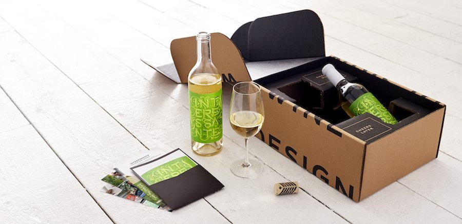
We caught up with Jessica Hische, the designer behind Interessante, to find out what inspired her recent design:
Jessica: One of the first things that popped into my head when I tried Andy’s [the winemaker’s] wine (I may have even said it out loud), was ‘Wow, this is interesting!’ I’m not a wine expert in any way shape or form, but I do tend to prefer wines with interesting flavor profiles, so it felt like a perfect match.
After meeting Andy and talking things through and learning about the history of his estate (originally founded by two Italian brothers), seeing the beautiful grounds and meeting his two awesome daughters (and hearing their own opinions about the labels on some of Andy’s other wines), I knew just where to take it. The design we ended up with is the Italian spelling/translation of the word Interesting — a word that I happen to use frequently because of a semester studying Italian in college. It’s viney, wild, and has a storybook feeling. It’s celebratory, but not serious — which we both felt captured the wine perfectly.
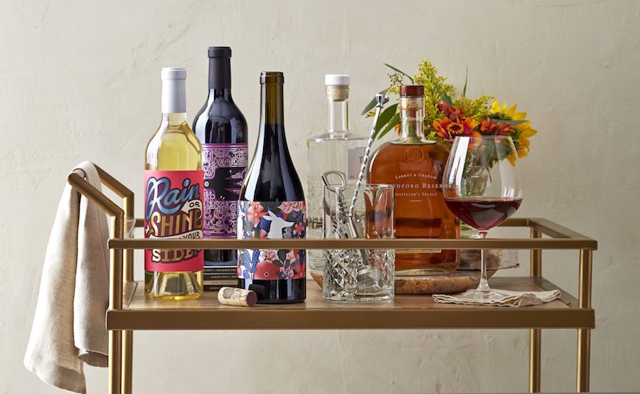
Next, we chatted with Helen Keplinger, winemaker of the (now sold out!) Me & You, on why she chose to partner with Barrel + Ink:
Helen: I was approached with two other new projects at the time, but Barrel + Ink was such a no-brainer great idea, I said yes immediately. Barrel + Ink had such good forethought, fresh thinking, and energy behind it, it was easily compelling. To put really creative winemakers with small lots of great wine and really talented graphic designer together — joining the “makers” — I thought that was really organic, authentic, and original.
… with Barrel + Ink, the designers are not bound by what a wine label ‘should be.’ They are using their artistic vision and creativity to bring a new expression to the face of the wine.
Erik [who created this label] is so brilliant with the expressions of fonts and the feelings they generate. It was so fun to see the attitude of the wine expressed in the art of the label as opposed to using the label as a marketing tool — it really brought the wine to life. Sometimes, wine labels are trying to express prestige, image, or status, but with Barrel + Ink, the designers are not bound by what a wine label “should be.” They are using their artistic vision and creativity to bring a new expression to the face of the wine. Having absolute freedom is really important here — for both makers. Both wine and art are living things that evoke feelings, and the way Barrel + Ink joins the winemaker and graphic designer gives both even more life. It’s playful and fresh — like drinking art, but not as serious as that sounds!
To learn more about Barrel + Ink, visit their website, and find them on Instagram, Twitter and Facebook. Cheers!
Images via Joshua Harding Photography

